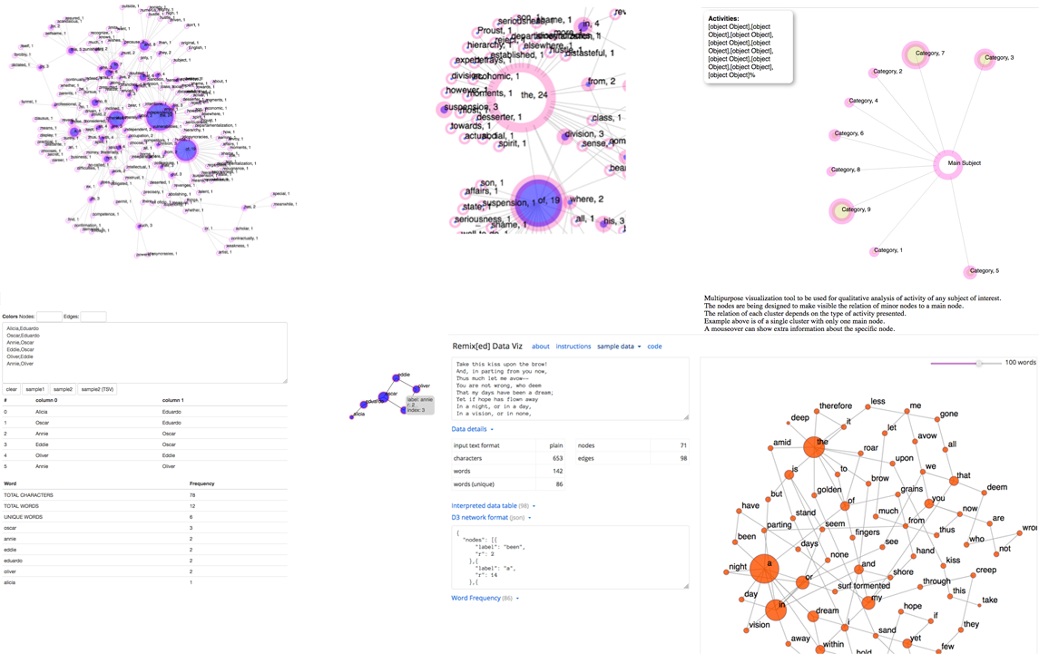
2016 - Present (Updated October 2018) Concept: Eduardo Navas This project was made possible with funding from The Art and Design Research Incubator (ADRI), and The Center for Humanities and Information (CHI) with support from The School of Visual Arts (SoVA) in the College of Arts and Architecture at Penn State. Notes of July 10, 2018 Remix[ed] Data Viz forms part of ongoing research on methods and development of data visualization applications that can present multiple types of datasets. The initial working version, which could be used as a template to input different types of data, demanded of the user to have reasonable technical knowledge. For this reason, the goal of the project became to develop a user-friendly interface, to eventually enhance the app to include multiple-visualization formats. The realization of this project has precedents in contemporary research on data analysis for image, sound, and text as explored by Eduardo Navas. Navas had previously developed a basic text-mining visualization method and tool for analysis of Theodor Adorno’s Minima Moralia. Navas was considering how to develop a friendly tool for general use, and discussed details of this with Dr. Graeme Sullivan, Director of the School of Visual Arts (SoVA). Dr. Sullivan, coincidently, was interested in a tool that could be developed or repurposed to show the relationship of different elements in clusters so as to visualize activities and performance within variable parameters that were determined by the user. His goal was to demonstrate patterns of performance and productivity that were characterized by differences in ‘kind,’ rather than differences in ‘degree,’ which is the common metric used in academic institutions. Navas invited Owen Mundy to collaborate and develop the interface and enhance the capabilities of the basic visualization so that it could be used with little technical need. The current tool is by no means complete but it now can be utilized by anyone. The current goal is to further enhance the basic features available. The tool allows the user to enter (copy-paste) a list of terms to learn of their corresponding number of recurrence. Their relation is mapped out as an interactive visualization of circular nodes and strings, shaped according to their inter-linkage throughout the text. The aim is to provide an intuitive yet accurate map of the quantitative relation of terms, which in turn can be evaluated qualitatively for better understanding of the actual content by examining word recurrence in relation to the group. There are limitations to the tool’s features, but now that the basic interface is in place, it is a matter of adjusting, and writing additional code that will make possible more features according to the emerging needs of research. It must be noted that there are quite a few tools that analyze data, particularly text. With this in mind, this tool is designed with a focus on remix principles. Through ongoing research, such an emphasis moves towards the possibility to evaluate the relation of image, sound, and text in terms of remix studies. Current features:
Future feature:
Project released during the month of October 2018 Eduardo Navas |
|
Screenshot: Various stages of development |
|---|
